
Are Your Paint Colors Quietly Sabotaging Your Routines?

Ever tried to kickstart a new habit (reading more, cooking at home, waking up earlier) only to feel like your house just isn’t on the same page?
It’s not your imagination. The colors in your home are quietly shaping how you feel and what you do every day. Color doesn’t just “set the mood.” It also sets the stage for how we live in a space. Some palettes energize us, others calm us down, and some unintentionally work against the routines and feelings we’re trying to cultivate.
Let’s take a look at how your different goals might be getting quietly influenced by the colors in your home:
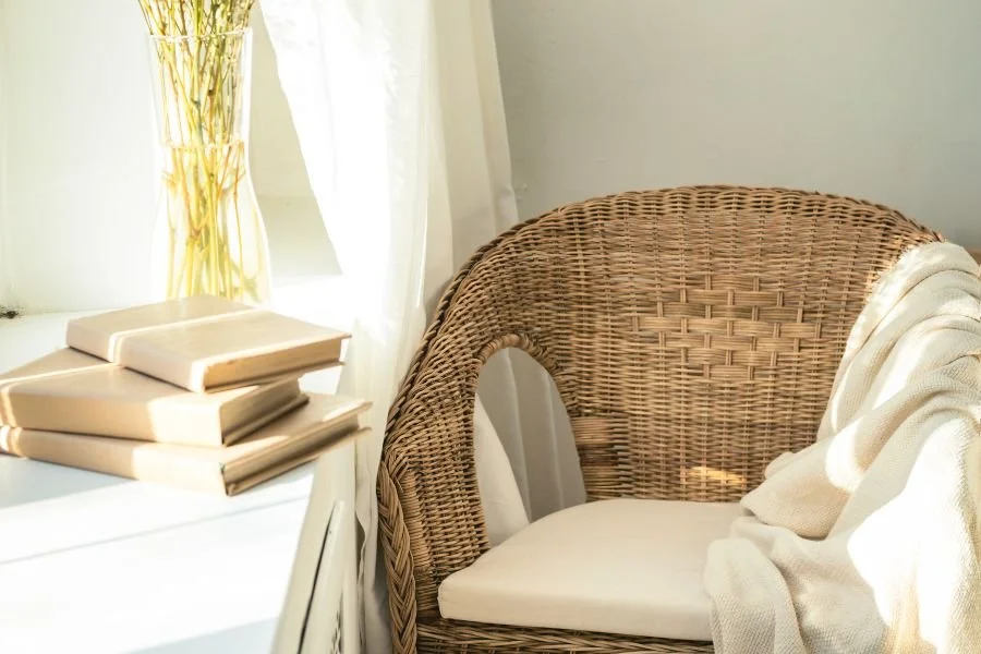
1. WANT TO READ MORE IN THE EVENING?
Avoid overly cool whites or flat grays in your reading nook. They can feel too sterile or cold to invite you in. Instead, go for warmer, cozy hues like amber, olive, or even soft clay tones. These colors help create that “curl-up-and-stay-awhile” atmosphere that pairs beautifully with a good book and a blanket.

2.
TRYING TO KEEP YOUR KITCHEN CLUTTER-FREE?
High-contrast color combos (like black-and-white or bold accent walls) can sometimes overstimulate your senses, making it harder to feel at ease. A softer, low-contrast palette (think creamy neutrals, wood tones, and gentle greens) can make the space feel more grounded and calm. And when your space feels calm, you’re more likely to keep it that way.

3.
NEED YOUR MORNINGS TO FEEL LESS CHAOTIC?
Dark or heavy colors can make waking up feel even harder, especially in low-light bedrooms or bathrooms. Try incorporating airy tones like soft peach, pale blue, or light sage. These colors reflect more light and give your brain subtle cues to start the day with clarity and calm.

4. STRUGGLING TO FOCUS WHILE WORKING FROM HOME?
Your environment has a direct impact on your mental sharpness. If your office feels too relaxed—maybe it's full of soothing tones or cozy textures—you might find yourself dozing off instead of dialing in. Introducing sharper contrasts and cool hues (like navy, charcoal, or even a crisp green) can signal to your brain: it’s time to get things done.

5. CRAVING MORE CONNECTION AROUND THE DINNER TABLE?
The right palette can invite people to gather, linger, and open up. Warm earth tones (like terracotta, rust, and olive) create a grounded, welcoming vibe. If your dining area leans too sleek, shiny, or cool-toned, adding warmth through textiles, lighting, or even wall color can shift the energy entirely.
A QUICK NOTE ON COHESION
While different rooms may call for different colors based on how you use them, there’s definitely an art to making those colors work together. You want your home to feel fluid, not disjointed or chaotic, and that means choosing colors that play nicely across sightlines and transitions.
That’s where a color expert can help. Whether it’s refining your palette or reimagining a single room, thoughtful color choices make all the difference between “nice enough” and “just right.”
Frequently Asked Questions
1. Can paint color really affect my daily habits and routines?
Yes. Color influences how alert, relaxed, or focused we feel in a space, often without us realizing it. When a room’s palette doesn’t align with how you want to use it, even well-intentioned routines can feel harder to maintain.
2. How do I know if a paint color is working against a room’s purpose?
If a space consistently feels uncomfortable, distracting, or uninviting despite being functional, color may be part of the issue. Rooms that feel too cold, heavy, or overstimulating often send mixed signals about how they’re meant to be used.
3. Should every room in my home have a different color palette?
Different rooms can support different activities, but they should still feel connected. Cohesion comes from choosing colors that transition smoothly across spaces rather than treating each room in isolation.
4. Can I adjust a room’s energy without repainting the walls?
Absolutely. Paint is powerful, but so are textiles, lighting, art, and furniture finishes. Adding warmth or contrast through rugs, curtains, lamps, or wood tones can shift how a space feels without committing to a full repaint.
5. When should I work with a designer on color selection?
If you’re feeling unsure, stuck, or worried about making costly mistakes, working with a designer can bring clarity. A professional can help you choose colors that not only look beautiful, but also support how you want to live in your home.
Ready to make your space feel more like you and more supportive of the life you’re building?
Book your personalized consultation today. In-home or virtual, I’ve got you covered.